Image with Hover Effect sub-brick
Bricks Demo
Versatile Bricks
Hero Image
This brick is useful as a substitute for carousels.
Accordion Demo
This brick is useful for info-dumps like FAQs, footnotes and references. Some of the options may not work properly, especially relating to images.
The number of nested levels is a bit much--the brick itself holds more than one accordion panel, each of which can contain columns, each of which contains sub-bricks, and so on.
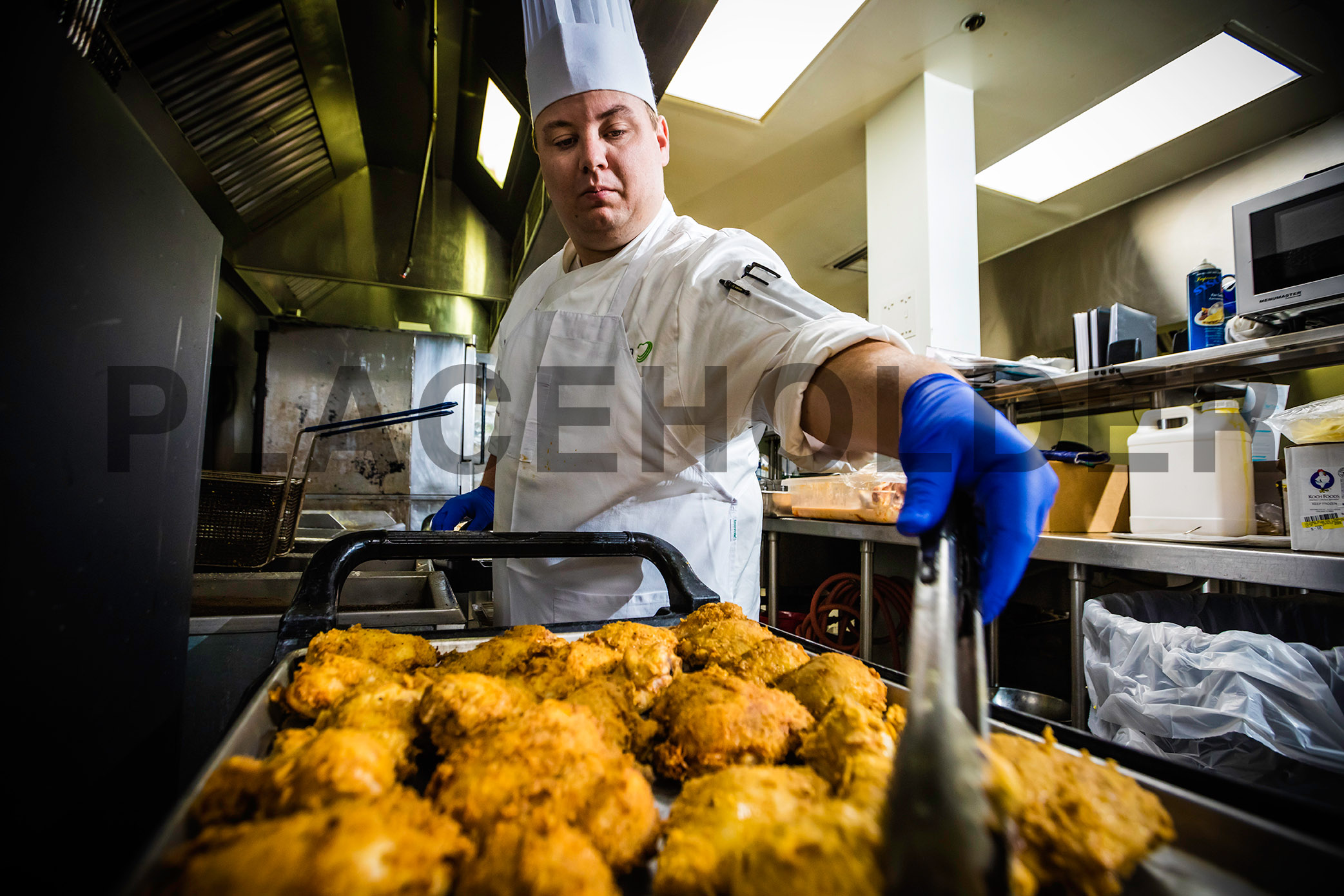

Tyson team members join in our spirit of giving through donations and support of volunteer projects. In 2018, we incorporated matched giving into our employee giving model. Giving Together is our matched giving program, through which Tyson matches donations up to $1,000 per year per team member. Through the program, team members can donate directly to the charities and nonprofit organizations of their choice via our online giving platform. We also expanded the list of eligible organizations for the program, allowing team members to donate to K-12 schools, colleges and universities, among many other groups.
* Includes 868,970 servings to Hurricane Florence victims and 1,200,000 to Hurricane Michael victims.
245E AMARILLO, TX
245C DAKOTA CITY, NE
245D EMPORIA, KS
278 HOLCOMB, KS
245J JOSLIN, IL
245L LEXINGTON, NE
9268 PASCO, WA
Alternative 3 Column Content Block
This one seems to display two equal columns and a third, smaller one.
Our broad portfolio of high-quality products and brands include:
Value-Added Foods: Value-added chicken, beef and pork, pepperoni, pizza toppings, bacon, deli meats, hams, franks, snacks, appetizers, prepared meals, meal kits and fully cooked dinner meats.
Prepared Foods: Appetizers, sandwiches, and tortillas.
Commodity Meat and Poultry: Fresh chicken, beef and pork, and specialty meats.
Alternative Proteins: Investments in Beyond Meat and Memphis Meats and co-led a seed investment round for Future Meat Technologies.
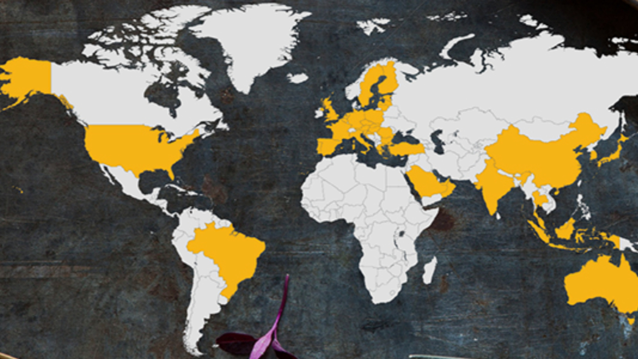
We primarily operate in the United States, China and India and sell food all over the world. In fiscal year (FY) 2018, we sold products in approximately 125 countries, with major sales markets in Canada, Central America, China, European Union, Japan, Mexico, Middle East, South Korea and Taiwan.

Columns
This one makes even rows of three columns each.
Note: Images in medium-sized screens will appear in low quality.
Copy Brick
The copy brick is a basic and relatively versatile component which displays single-column page-width copy or images. It features limited text styling options, including subscripts and superscripts.
Links are automatically styled like this. They cannot be styled differently except with the CTA Link style (below).
Inline images up to 1.5 MB may be added. Large images will automatically resize to fit within the copy margins.

Images may be resized (but may be distorted). If highlighted, images may be aligned as text.



There is a horizontal rule:
These are the text formats available:
H2
H3
H4
Blue Paragraph
Medium Paragraph
Small Paragraph
Block Quote
H2 Dashed
H3 Dashed
This is another copy brick, demonstrating the component's other background color option.
There is a 100% width option, but it is only for displaying large images in block format, as below.
Note that the first image above is restrained by the copy margins, but the image below is the full width of the page (same width as the top navigation bar).

Image Offset
This one is like a Media with Copy brick, except with a parallax effect which pushes the image behind the copy box.
Copy
Media with Copy
This one is used a lot—the Copy section can be formatted as a Copy brick, and it looks best if H3 Dashed is used for a heading above the body copy, and a CTA button is placed below. Otherwise, it can be hard to visually balance the image and copy.
Multiple Column
This is a useful component. It contains a variable number of equal-width columns, each of which contains either Media or Rich Text sub-bricks. Note that the Rich Text sub-brick is better, as it can include media (which can then be adjusted, as in a Copy brick), while the Media sub-brick has no options.
This bricks will display three images side by side in -test but will not work in production.
At this global gathering of world leaders, Tyson Executive Vice President Alternative Proteins and Chief Sustainability Officer Justin Whitmore engaged with other large companies in conversations about the global food system. Dialogues focused on the need for a food system that is climate smart, inclusive, healthy and affordable. Through collaboration, we can help build a system that focuses on better health outcomes, broader offerings and more sustainable food. Policy leaders, governments and other industry players around the world are looking to Tyson as a leading voice in this effort.
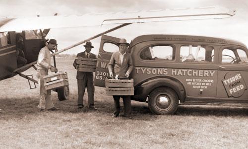
Paul Voerhoen
LOREM IPSUM - INSERT YOUR CODE HERE
Our corporate responsibility programming reflects a new vision based on two key principles:
- Ensuring initiatives are focused on delivering a quantifiable social or economic “return” for the investment of time, energy and money
- Building win-win strategies
and partnerships
These guiding themes serve as pillars for how we develop and manage all we do, and nowhere is that more prevalent than with our grantmaking activities.
We seek to make strategic investments that will yield a positive social change to ensure all stakeholders benefit.
To realize our corporate grantmaking strategy we have made several changes:
- In partnership with community stakeholders, we developed an investment strategy based on the most important social risks facing the community and company: hunger relief and reducing the social challenges that cause instability in our hourly team members’ lives.
- Tyson’s grant solicitation process is targeted to prioritize communities where we have a plant.
- The grant solicitation process centers on “closed” invitations where we invite select nonprofits to respond to a request for proposals; however, we also have an “open” category where nonprofits can submit requests based on their interests.
- All grant applicants must articulate a “Performance Target” – a quantifiable goal they seek to attain by using Tyson’s grant money, as well as information about how they will measure progress.
- Tyson actively relies on an internal Advisory Committee to help make investment decisions and ensure transparency with spending practices.
Tyson Ventures Broken Multiple Column

Amy Tu,
President

Rahul Ray,
Director

Kate Powell,
Associate

Gordon McGrath,
Corporate Counsel

Kyle Childers,
Corporate Counsel
Offset Content 2-Column
Two columns with width options: a wider right column (30%/70%), a wider left column (70%/30%), or even columns (50%/50%).
Each column may contain multiple sub-bricks, either Media or Rich Text (Copy). The Media brick is not recommended, as it has no options; instead, an image can easily be added to the Rich Text brick and then resized/adjusted.
Our broad portfolio of high-quality products and brands include:
Value-Added Foods: Value-added chicken, beef and pork, pepperoni, pizza toppings, bacon, deli meats, hams, franks, snacks, appetizers, prepared meals, meal kits and fully cooked dinner meats.
Prepared Foods: Appetizers, sandwiches, and tortillas.
Commodity Meat and Poultry: Fresh chicken, beef and pork, and specialty meats.
Alternative Proteins: Investments in Beyond Meat and Memphis Meats and co-led a seed investment round for Future Meat Technologies.
Pull Quote
Pretty self-explanatory. Quotation marks added automatically—do not include these in the Quote Field.
- Background: Selection (examples below)
- None
- Wood Grain Texture
- Blue
- Gray
- Light Blue
- Quote Field (Lorem ipsum... below)
- Byline Field (Byline in the first three examples below)
- Signature Image: Add New/Existing Media (the image in the examples below; it overrides text in the Byline Field)
Section Header
This brick seems to be the only way to add an H1 heading to a page. For SEO purposes, each page should have no more than one.
Section Title
Selectable Panels
Each option in the dropdown menu is like a sub-page, built from a limited selection of bricks, but some of these may not work.
Copy
Tiles
Vertical tiles in rows of up to three. URL required. Take care to use images that are dark enough to make the white text legible, with no important image elements in the area covered by the text.
While the component does not require the copy below the dash, leaving it blank would render the dash off-brand.
Technology At Tyson Videos Explainer
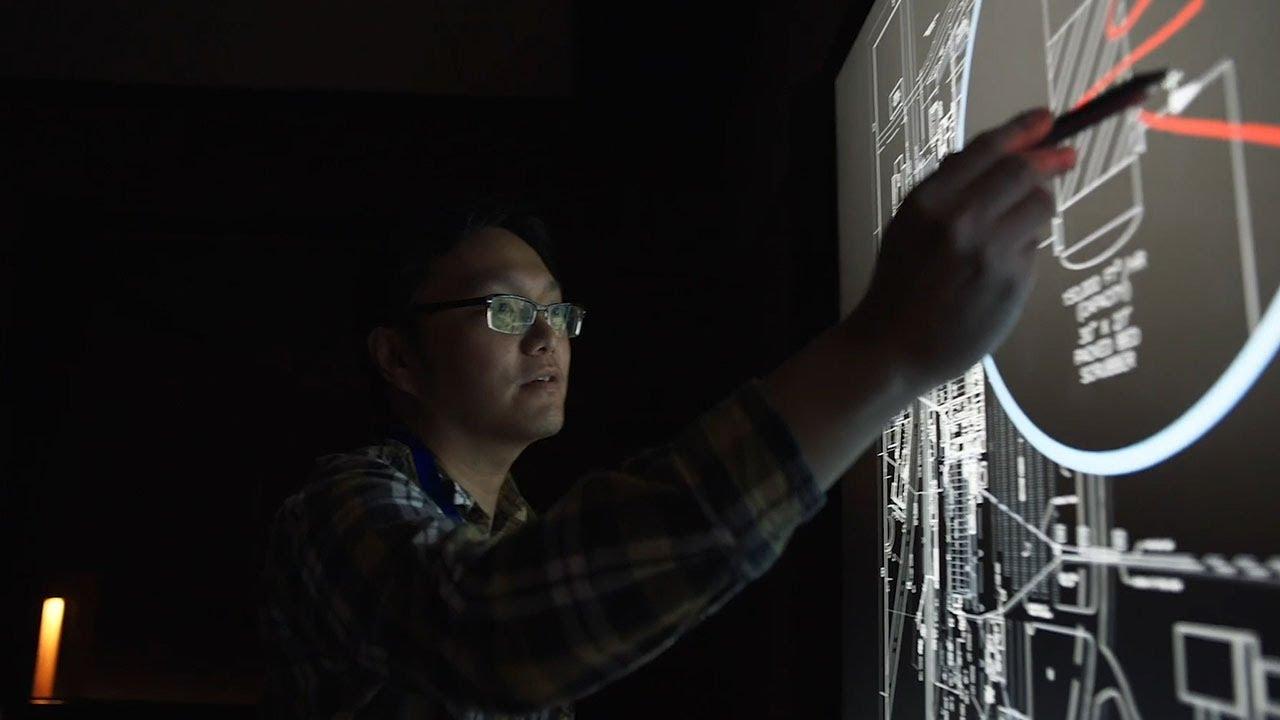
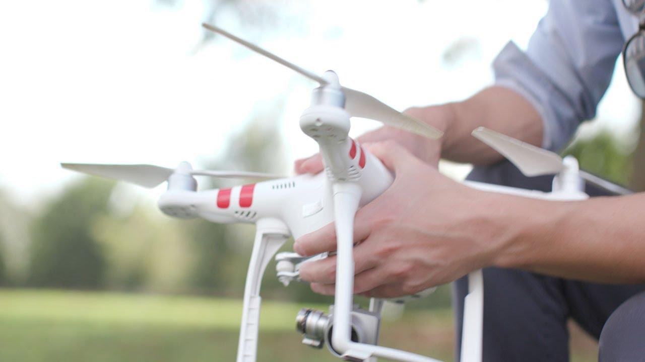
You might be surprised with the tech we're exploring at Tyson! From AI and machine learning to robotics and automation, what we work on is found on farms, in plants, at our corporate offices, and in the hands of our CEO.
Emerging Technology Explainer
Explore with us Explainer

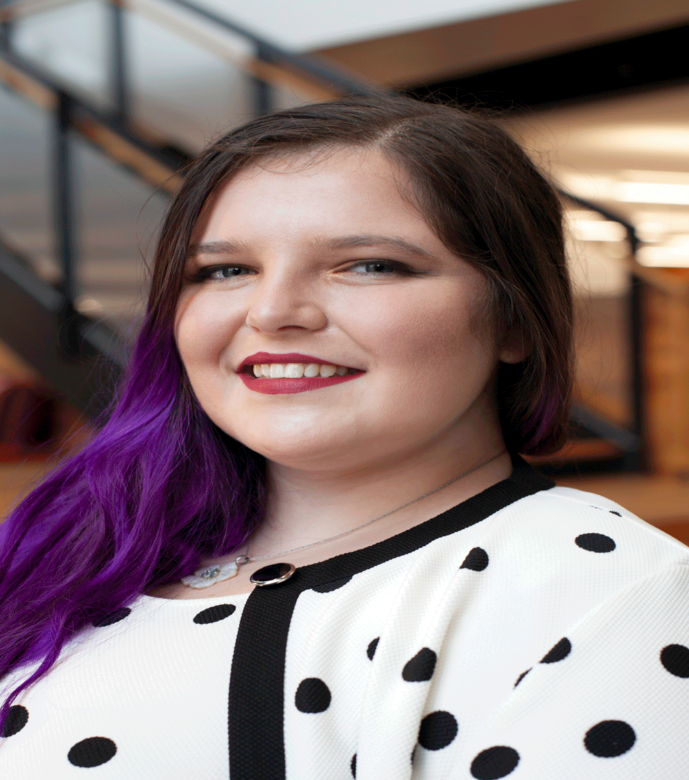
Practice Areas Grid Explainer
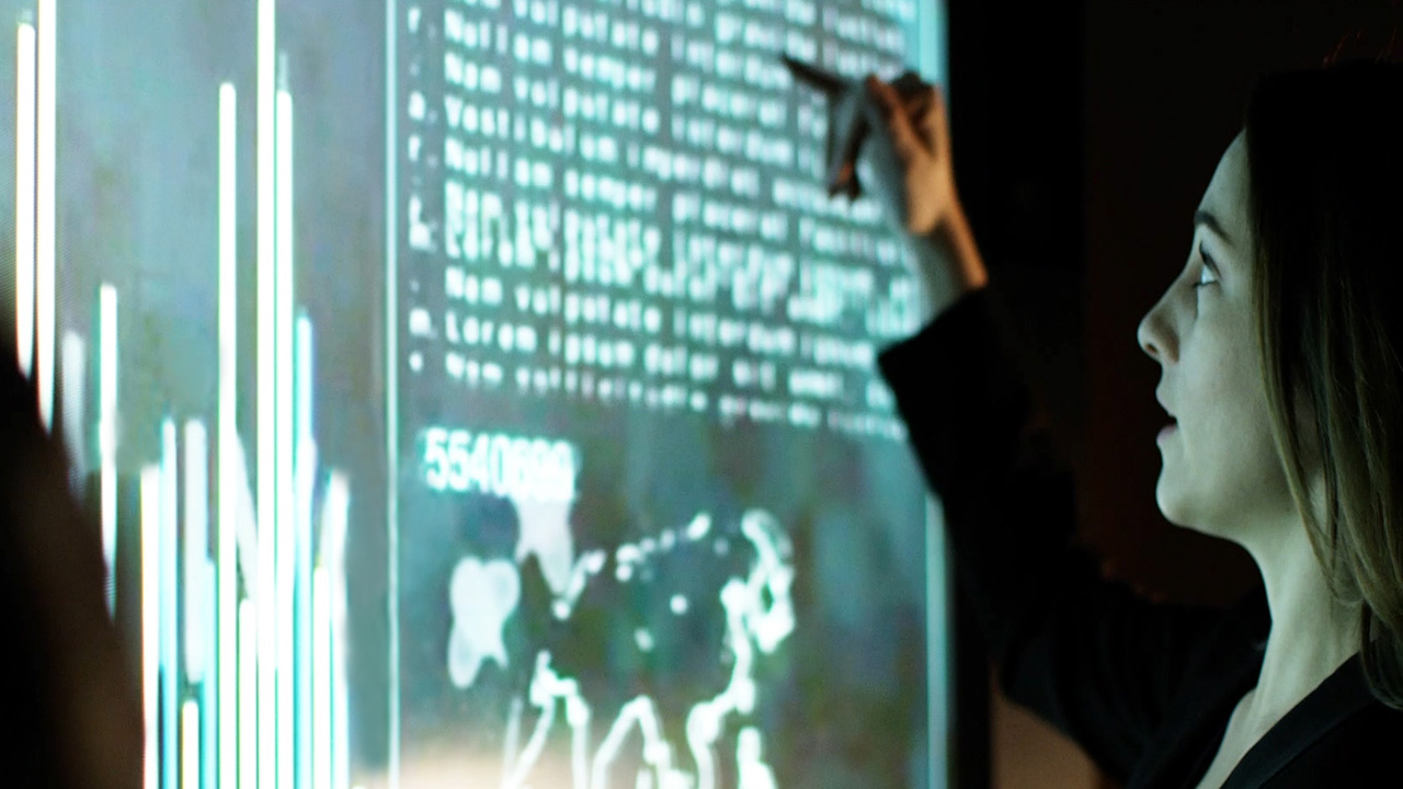
Our data scientists are developing algorithms to surface new insights and improve the decisions we make.

Our architects investigate new technology and lay the foundational structure for our technical solutions.

Our developers and engineers understand, organize, and develop ways to harness the power of our data.

We have a wide variety of infrastructure needs and are increasing our adoption of cloud native solutions.
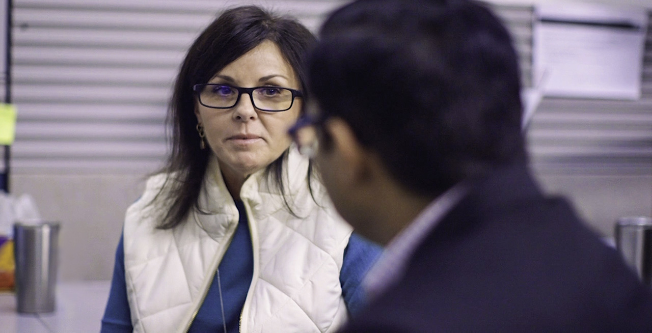
Our program and project managers excel at coordinating work across our functions using agile methodologies.
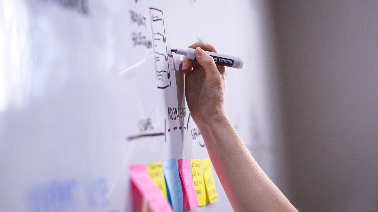
Our analysts future proof and plan out how our technology teams partner for Tyson Foods' long-term success.
Video Callout Explainer
Women in Technology
Limited-Use Bricks
Carousel Explainer
Hyperlinks open in a new tab. There should be an option to open in a new tab.
Carousel Explainer (Update)
The carousel now works as intended, with some quirks:
- Use only the Horizontal Hero theme - not Horizontal Slide (default).
- Images should be
- approximately 1300x500,
- dark (the carousel darkens the image, but not enough for bright images; the other overlay options do not work),
- simple (since busy images make the text very hard to read), and
- completely free of text (even incidental text).
- Image subjects should be
- grouped left or right (or both, if text is centered), and
- away from the horizontal centerline (the patty part of the hamburger).
- This is because the header is not restricted to left/right like the copy, and it's more or less centered vertically; so, long headers will cover the middle of the image, all the way across. Best just to use short headers.
- CTA theme options mostly work, but...
- the whole slide is linked, so the CTA Button isn't actually necessary--but it's still required by the component, and using a space instead of Link Text will create an ugly little empty button;
- you can get around this by using the Video Play CTA theme with a space instead of Link Text (the link doesn't have to be a video).
- Theme (large/full bleed) doesn't seem to do anything.
- Neither do the overlay options, which means the darkening effect cannot be turned off. Images with text built-in (such as we've used in Copy bricks) will look wrong, even without the component adding text on top of them.
Locations Map
This component displays a map of Locations. On this site, "Location" is a category of content which can be added; each location on the map corresponds to an individual piece of content. Locations are added through the Drupal main menu, not this brick.
The only option for this brick is the Heading field ("Heading" in the example between the horizontal rules below).
News Feature
This brick is used on the front page. Like the Blog Carousel, it only links to existing pages on TysonFoods.com—but it links to press releases instead of blog posts. Also like the Blog Carousel, it seems to provide an option to build a press release entirely within the carousel brick itself, but I have not tested this feature. It is unneeded and unnecessarily complicated.
Again, this component could be more useful if less specific. It would be better as just a neat way to display whatever links the page author wanted to present.
Alternatively, if it is to remain specific to news releases, then could it not be automated to fetch the latest releases, as the Press Release Gallery brick does? As it is, someone must manually update this brick on the front page every time a new press release is published.
Note: the pages linked in the example below were selected at random.
Brand Carousel
This is a specialty component which apparently only works when you create a certain number of sub-bricks. Must have something on the link field.
Next/Previous Block
The Next/Previous Block displays two links, labeled "Previous" and "Next," at the left and right margins of a blue-background block. There are no display options; the only fields available are the two URLs. It can only look like the example below (between the horizontal rules, which are Copy bricks).
Press Release Gallery
This is the specialty brick used on the News Releases page. It has no options, and will always look like the example below (between the long horizontal rules--but note that the gallery itself uses slightly shorter horizontal rules to separate entries).
Removed to keep this page from showing up in every site search.
Video Gallery
This is a specialty brick that displays videos. It will always look like the example below (between the horizontal rules).
Removed to keep this page from showing up in every site search.
Sustainability Hero Explainer
Do not use. Will break page.
